Accessible by Design
May 27, 2016
When designing a site for those with low or declining vision, every choice matters. Fonts, colors, and navigational labels take on new significance when it comes to the job of ensuring accessibility.

Whenever we create a new website at Spark, we make it our goal to create an effective site for the inherited retinal disease (IRD) community. We know an effective website has to do more than just provide information about IRDs and the importance of genetic testing. Our sites also need to make the information easy–to–access by everyone: the fully sighted, as well as those with limited or no vision. Our goal is to create accessible websites, just as an architect designs an accessible building, where everyone feels welcome.
Throughout the creation of our sites, we follow accessibility guidelines established by the World Wide Web Consortium (W3C), an international group that develops website standards. These guidelines tell us that an accessible site is:
- Perceivable: Information can be “seen,” in one way or another, by everyone
- Operable: Visitors can successfully move around
- Understandable: Information is easy to understand, and the site is easy to use
- Robust: Information can be interpreted by accessibility tools (ATs)
Sites that don’t meet these four criteria can be challenging, or even unusable, for people with low vision. To avoid that possibility, we rely on W3C principles to guide each step, and to make our sites accessible to all of our visitors.
We set out to create an accessible website, just as an architect designs an accessible building, where everyone feels welcome.
Design
Based on W3C guidelines, our design decisions help ensure Spark’s sites are easier to read, use, and understand.
- Color Palette: Creating a good–looking site is always important, but when choosing colors, our priority is to address the needs of the IRD community. We select colors that not only contrast well against the background, but also against each other. We follow the W3C–recommended contrast ratio, so that text is legible for those who don’t see the full color range and use blocks of color that are easier to distinguish. We also use white text on dark backgrounds and bring in pops of color to call attention to information or actions that are particularly important. While not all colors we use are visible to everyone, they are still distinguishable when converted to the colors seen by those with color vision deficiency.
-
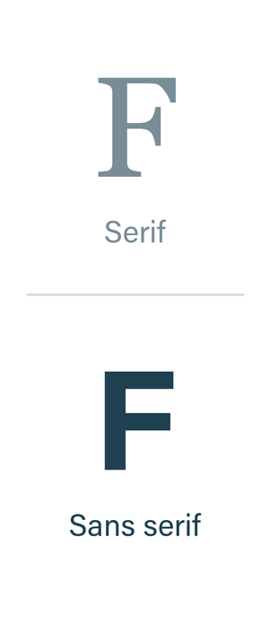
Fonts: We tend to choose sans serif fonts, which are simple, non-decorative fonts that most people find easier to read. Sans (“without”) serif fonts lack the line or base extensions, called “serifs,” that can make letters difficult to distinguish from each other. Popular sans serif fonts include Arial and Helvetica. We try to stick with fonts that feature distinctive letters, even spacing, and large counters (the space inside an “o,” “d,” or “b”), all of which help visitors more easily decipher the characters, and in turn, the words. For even more legibility, we utilize bold type and avoid italics throughout the site.

- Icons and Images: In website design, icons and images are often used as visual aids, or to represent text, functions, or information. The icons we use are typically simple, specific, and easily recognizable. We want to ensure that everyone can use the images on our sites, so we included a zoom feature, which enlarges photos and graphics that communicate important concepts. Finally, we make sure screen readers can accurately describe every image, by including descriptions of all images and photos, either on the site or in the code.
![]()
![]()
![]()
Writing and Organization
We created Eye Want 2 Know to share important information on genetic testing and inherited retinal disease. We wanted to make it usable and meaningful for you, so we kept the writing clear, concise, and understandable. For every video, we include a transcript, and throughout the site, we intentionally choose words for how they sound, knowing that many users will access the site through screen readers.
We streamlined the layout by avoiding unnecessary details and repetitive content, and we clearly labeled buttons and links with informative language. Instead of “Click here,” you’ll see, “Watch the video” or “See how it works.” All of these choices improve usability for everyone.
Coding for Accessibility
EyeWant2Know.com is accessible both in how it’s designed to look, and how it’s designed to work with accessibility tools (ATs). Screen readers are the most popular AT for those with low vision.
Screen readers, web browsers that read websites out loud, often have a high learning curve and can be frustrating to use when a site is not designed or coded correctly. In fact, a poorly built site can sound like a mess.
Here are a few examples of how we avoided that problem through proper coding:
- Site functionality is available from both the mouse and the keyboard, to make navigation easier for many users, and improve the screen reader experience.
- We coded the site to skip repetitive navigation, which can be helpful for sighted users, but tedious when using a screen reader.
- We accurately labeled site elements, such as images and form fields, providing invaluable information for those using screen readers.
Dealing with Accessibility Issues
While we try to design off Spark Therapeutics’ websites to be accessible, especially to those with IRDs, that doesn’t mean they are perfect. Throughout the testing process, we evaluate our sites for accessibility, using a variety of tools intended for just that purpose. When we find an issue, we define and measure it to determine if and to what extent it will impact our visitors. Whenever an issue causes a negative impact, we fix it.
Share Your Experience
Designing our websites involve deliberate decisions about colors, fonts, writing, organization, and coding; each was made with you in mind. We hope that Eye Want 2 Know meets your needs, answers your questions, and provides a sense of community, but please let us know if you’re experiencing any problems accessing the content.
Sign up to find out when we add new stories to the site.
